

The numbers are illustrative. The difference between the two panels is not design, it is how many questions each one leaves for the checkout page to answer.
Roughly 48% of abandonment is caused by extra costs appearing too late, and the cart is the last screen where too late has not happened yet. A default Shopify cart typically shows a subtotal, a checkout button, and the sentence "shipping calculated at checkout", which defers the single most damaging question in the funnel to the exact step where deferring it costs the most. A working cart answers three things: what it will cost in total, when it arrives, and what would make the shipping free.
Why the cart and not the checkout
Shopify's checkout is largely not yours to rebuild, and that turns out to matter less than it sounds, because most of what goes wrong at checkout was decided before the shopper got there.
Chapter 3.3 ranked the causes. The top one, at roughly 48%, is extra costs that were too high or shown too late. Read the second half of that sentence carefully: too late is a placement problem, and placement is entirely in your control.
A shopper who learns about shipping in the cart can respond to it. They can add an item to clear a threshold, or accept the number and continue, or leave. A shopper who learns about it on the payment step has already invested in the process and now experiences the same number as a change to the deal.
Same $5.90. Two completely different events.
The cart is the last screen where a surprise is still information. After that it becomes a betrayal. The Dropshipping Playbook
The three questions a cart has to answer
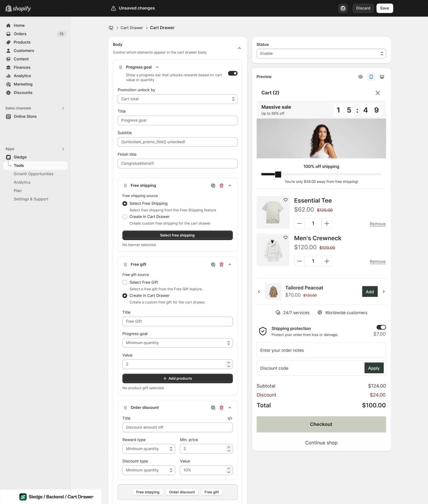
Every block in the left column answers one of the three questions, or it does not belong in the drawer.
If your cart answers all three, most of this chapter is already done.
actually cost?
it arrive?
better version?
The progress indicator earns its place
Of everything in this chapter, the distance-to-threshold line is the one that does two jobs and costs no margin.
It removes a surprise, because a shopper who can see the shipping rule is no longer going to be startled by shipping. And it raises order value, because "$10 away from free shipping" is a specific, achievable instruction rather than a vague suggestion to buy more.
Published threshold studies put the AOV lift from a visible progress indicator somewhere in the 17 to 30% range. That upper figure comes from sources with something to sell, so treat the bottom of the band as the planning number and anything above it as upside.
A progress bar pointing at a threshold 80% above your average order does not motivate anyone; it just displays how far away free shipping is. Set the number first, per chapter 4.1, and add the indicator second.
Why exactly one upsell
The cart is a confirmation screen. Someone reaching it has finished the hard part of shopping, which is choosing, and the psychological state they are in is closing rather than browsing.
One relevant add-on reads as a helpful reminder. Three read as a new aisle, and reopen a decision that was about to complete. This is the most common way cart upsells underperform: not because the offer was wrong, but because there were four of them.
What to put in the slot, in order of what usually works:
- The consumable or accessory the item in the cart needs to be used
- The cheapest item that would clear the free-shipping threshold
- A genuine complement people already buy together, checked against your own order data
- Nothing at all, if none of the above is true. An empty slot beats an irrelevant one
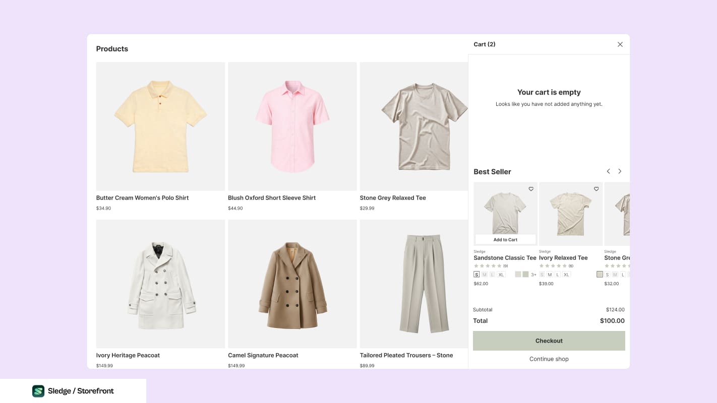
An empty cart is still a surface. What sits under it is one relevant row, or nothing.
What not to put there: a second version of the item already in the cart. That is a substitute, not an add-on, and it converts a purchase back into a comparison.
On a phone, this is a different component
Community audits of new dropshipping stores keep finding the same thing: the Add to Cart button barely visible on mobile. The cart drawer has the same problem one step later, so check it rather than assuming the desktop version scaled.
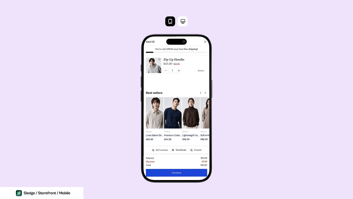
The checkout button pinned to the bottom, with the total beside it. That is the layout the list below is checking for.
- The checkout button is reachable without scrolling the drawer
- The total, shipping and delivery line are all visible at the same time as the button
- Closing the drawer returns to the same scroll position, rather than the top of a collection
- The drawer works inside a social app's in-app browser, which is where most social traffic actually checks out
- Quantity controls are large enough to hit without zooming
What to change, and in what order
- Show shipping or the shipping rule. Free, and it is the 48%.
- Add the delivery window. Free, and it lowers dispute risk at the same time.
- Add the threshold distance, once the threshold itself is set correctly.
- Add one add-on. One.
- Test the whole thing on a phone, in an in-app browser, before calling any of it done.
One at a time, dated. The first two are free and are the two most stores are missing, which makes them the best-value hour in this level.
Common questions
Drawer or cart page?
Won't showing shipping in the cart lower conversion?
How many upsells should the cart show?
Should I show a countdown timer in the cart?

The app behind these fixes
Most of Level 04 is a setting in Sledge rather than a project.
See it on the Shopify App Store