

Our own framing rather than measured data. The underlying distinction, substitute against complement, is standard; the placement mapping is the useful part.
There are two kinds of recommendation and they are opposites. A substitute is another version of the same decision, and it helps a shopper who is still choosing. A complement is something that goes with a decision already made, and it helps a shopper who has chosen. Most stores put a generic "related products" row in every slot, which means half the placements are actively working against the sale: an alternative shown in the cart reopens a decision that was about to close.
The distinction that decides everything
A recommendation is one of two things, and confusing them is why so many stores conclude recommendations do not work.
Another size, another colour, another price point, a competing model. It is useful while the shopper is still deciding what to buy, and it is a direct threat to the sale once they have decided.
Substitutes belong on collection pages and product pages. They do not belong in a cart.
The refill, the case, the thing that makes the first thing usable. It adds to a decision rather than competing with it, which is why it is the only kind that is safe after the choice is made.
Complements belong on product pages and in the cart. On a collection page they are usually premature, because the shopper has not yet picked the thing they would be complementing.
An alternative shown to someone still choosing is help. The same alternative shown to someone who has chosen is a reason to start again. The Dropshipping Playbook
The placement map
| Placement | Shopper state | Show | Do not show |
|---|---|---|---|
| Collection page | Comparing | Alternatives, sorted usefully | Accessories for nothing |
| Product page, above the fold | Evaluating one thing | Nothing. Sell this product | Anything that pushes Add to Cart down |
| Product page, below | Still evaluating | Alternatives and complements | A row of near-identical items |
| Cart | Confirming | One complement | Any alternative, and any second offer |
| Post-purchase | Committed | Complements and refills | The thing they just bought |
Row two is the one people fight about. The instinct is that more options above the fold means more chance of a match. What it actually does is push the delivery window, the price and the Add to Cart button further down a phone screen, and the store audit in chapter 1.4 found a barely visible Add to Cart button to be the single largest conversion killer. A recommendation that displaces the buy button is a net negative no matter how relevant it is.
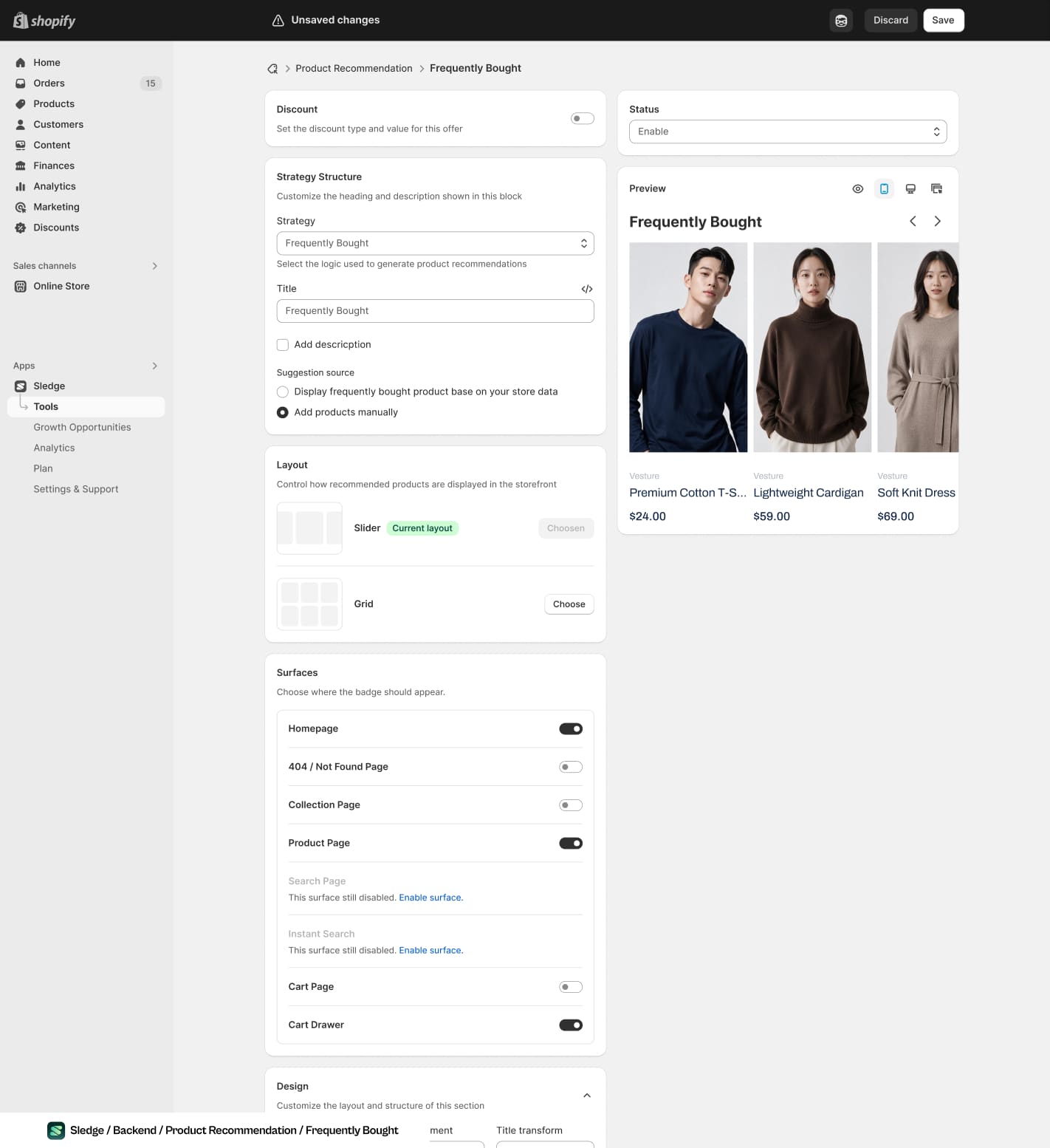
The surface toggles are the table above in settings form. Product page on, collection page off, cart drawer on.
Build them from your data, not your categories
The default in most themes is to pull products sharing a tag or a collection. That is cheap and it is why the row so often reads as filler: it is a list of things that resemble each other, which is a statement about your taxonomy rather than about what shoppers want.
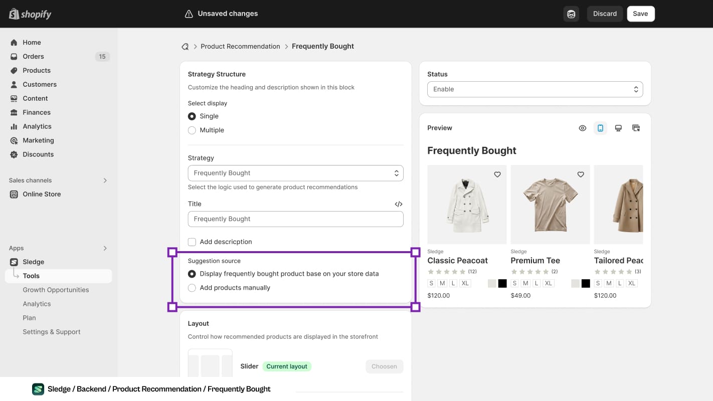
One radio button decides whether the row comes from your order history or from somebody's guess.
Better sources, in rough order of usefulness:
- Products that appear in the same order, from your own order history
- Products viewed in the same session before a purchase
- What shoppers searched for immediately after viewing this product
- Manual pairing for your top ten products, decided by a person who knows the category
- Category tags, as the fallback for the long tail only
Note that three of those five are the discovery-layer events chapter 3.4 covers: they are not in a standard report and they are not retroactive. If nothing is recording them, categories are all you have, which is exactly why so many stores end up there.
The discovery job people forget
Recommendations are usually sold as an order-value tool. On a large catalogue their bigger contribution is often reachability.
Chapter 3.5 described the state where most of a catalogue gets no views: not because the products are unwanted, but because no browsing path and no search leads to them. A recommendation row is one of the few mechanisms that puts a product in front of somebody without requiring them to have looked for it.
Which means the check on your recommendation system is not only "did order value rise". It is also: how many distinct products got shown this month, and how many of those had zero other traffic.
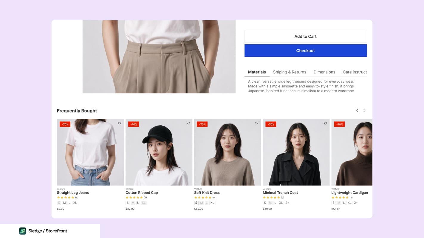
The row sits below the buy button. Five products get a view here that no browsing path would have given them.
A recommendation engine trained on sales will keep recommending what already sells, which makes it sell more, which reinforces the recommendation. Left alone it narrows your effective catalogue to the products that were already winning. Reserve a slot for something outside the top sellers, and check the spread rather than only the lift.
How to judge whether it worked
- Attach-rate, not revenue. What share of orders containing product A also contain the thing you recommended beside it?
- Contribution per order, not average order value, so a discounted add-on cannot flatter the result.
- Distinct products viewed, to see whether reachability improved or the winners just got wider.
- Cart abandonment, specifically, if you added anything to the cart. A rise there means you reopened a decision, per chapter 4.3.
And change one placement at a time. Recommendations are easy to add everywhere at once and impossible to attribute afterwards, which chapter 5.2 covers in full.
Common questions
Why doesn't my 'related products' row do anything?
Should recommendations be automatic or hand-picked?
How many recommendations should a product page show?
Do recommendations help discovery or just order value?

The app behind these fixes
Most of Level 04 is a setting in Sledge rather than a project.
See it on the Shopify App Store